Over the last five years, much of craft beer’s momentous growth was achieved through the high margins yielded by taproom sales. Rather than selling beer at a discount to wholesalers, who would, in turn, sell the beer to a retailer, craft brewers could sell directly from their taprooms and keep the margin that normally got split between each party in the three-tier system. The increased margins put more money in the pockets of brewers, who then used those funds to grow, reinvest, and explore.
Other than the brewers, another beneficiary of this system were artists, who breweries hired to help differentiate themselves in an increasingly crowded market. Artists focused not only on merchandise and branding but on can design, which almost single-handedly (and sometimes accidentally) helped breweries establish compelling visual identities.
In 2020, with COVID-19 keeping people out of taprooms, it was more important than ever to obtain brand differentiation. And many artists rose to the challenge.
Over the course of the year, in shooting photography of hundreds of beers and considering thousands more, we kept track of our favorites. We present our choices in no particular order except for A Deal With The Devil by Anchorage Brewing and Rob Bowyer, which we name the best craft beer label of 2020.
Scroll through them all or jump to your favorite:
- Anchorage Brewing Company – A Deal With The Devil
- Shacksbury Cider – Lo-Ball
- Trophy Brewing Co. + Salud Cerveceria ¡El Jugo Suelto!
- Humble Sea Brewing Co. – Gnarcholas Cage
- Flying Machine Brewing Company + Haw River Ales – Lagerish
- Red Clover Ale Company – American Redstart IPA
- Tactical Brewing Company – Guavango Montoya
- Untitled Art – CBD Sparkling Water
- Channel Marker Brewing – Turn of the Tides
- Double Nickel Brewing Company – Super Mega Dank 420 Kush Grand Daddy Supreme
- Pure Project Brewing – #ISO
- Tröegs Independent Brewing – Haze Charmer
- DSSOLVR – Thank You For Existing
- Brouwerij West – Hollywood Acid
- Wiley Roots Brewing Company – Imperial Somethin’ Got Played In The Mail
- Resident Culture Brewing Co. + Outer Range Brewing Co. – Out to Pasture
- Oozlefinch Beers & Blending – The Very Thirsty Caterpillar
- Outer Range Brewing Co. – Upcountry
- Good Word Brewing – We Are America
- Tripping Animals Brewing Co. – Steamin’ Key Lime
The Best Craft Beer Labels of 2020
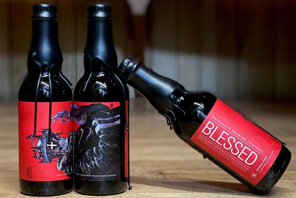
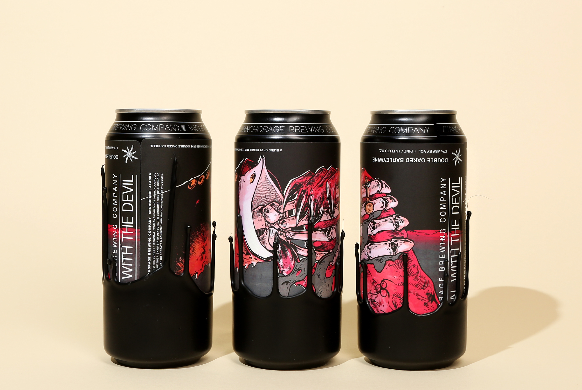
A Deal With The Devil
Anchorage Brewing Company – Anchorage, AK
Art By Rob Bowyer
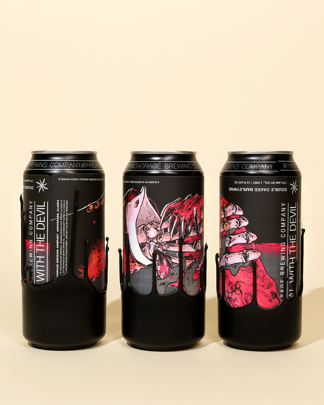
If any can perfectly captures craft beer culture in 2020, it’s A Deal With The Devil From Anchorage Brewing in Anchorage, Alaska. This is a culture characterized by hype. Indulgence. Sloth. And that’s exactly what the label conveys.
In order to understand why the label is so effective, one needs to understand the beer. A Deal With The Devil is one of the highest-rated barleywine-style ales ever made, a 17.3% ABV behemoth brewed with Galaxy hops and aged in barrels. The beer itself is a masterclass in excess.
To build on this theme, Anchorage founder Gabe Fletcher had the beer put into a historically maligned packaging format: the 16-ounce aluminum can. Then, in a big f-you to purists who only package their fine beverages in glass, Fletcher had the cans dipped in black wax. Upside down.
Only 4,272 of the 16-oz cans were made, all of which sold out in minutes. At $50 per can. There’s something gross about that, and also something beautiful.
No matter how you feel about A Deal With The Devil, the beer, packaging format, name, label, and embellishments come together to tell a perfect story. And that’s the essence of good design.
For that reason, we name A Deal With The Devil the best can design of 2020.
Lo-Ball
Shacksbury Cider – Vergennes, VT
Art by Will Bryant and Bart Sasso
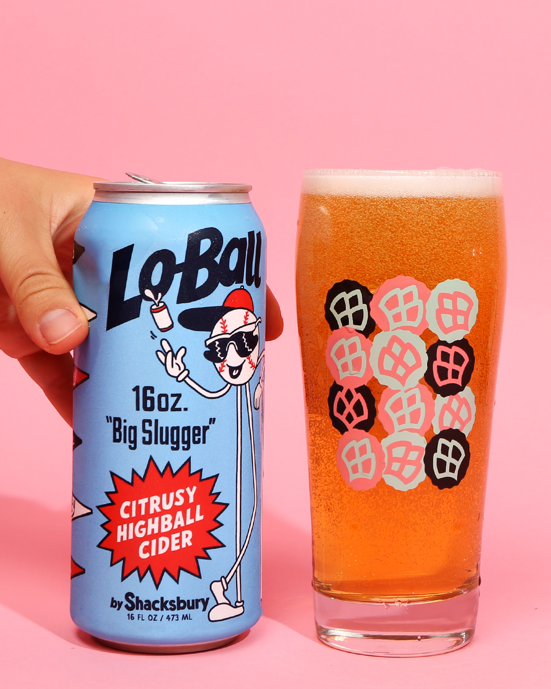
Last year, Shacksbury Cider took the top prize on our Best Label Design of 2019 list. This year, they came out swinging again with Lo-Ball, a citrusy highball-style cider.
At only 4.8% ABV, the cider goes down smooth. As does the goofy, playful label, which evokes an older, perhaps friendlier time when the Great Bambino was still calling his shots.
Once again — and forgive us the pun — Shacksbury and artists Bryant and Sasso knocked it out of the park. No fouls here. The product is a homerun.
Okay, we’re done.
¡El Jugo Suelto!
Trophy Brewing Co. + Salud Cerveceria – Raleigh, NC + Charlotte, NC
Art by Thomas Jennings
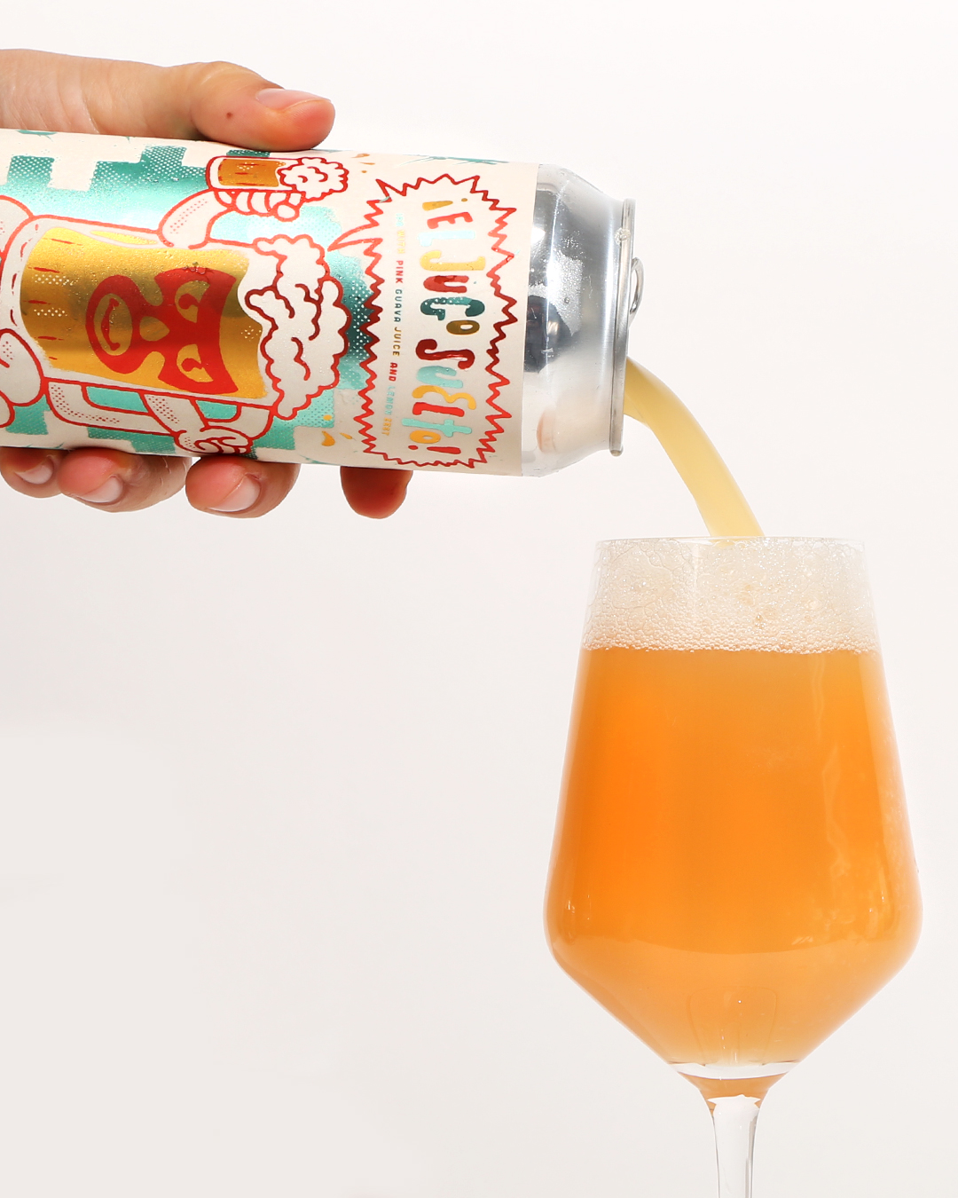
Two North Carolina neighbors pay homage to luchador culture with this rad can. Roughly translated as “The Juice is Loose,” ¡El Jugo Suelto! is a 4.7% hazy IPA brewed with pink guava juice and lemon zest.
But honestly, we don’t care how it tastes — the expressive art, which uses the same color palette as the flag of Mexico, screams “Buy me for the can.” Throw in a metallic pop and you’ve got a strong contender for the belt. Er, best can of the year.
Gnarcholas Cage
Humble Sea Brewing Co. – Santa Cruz, CA
Art by Frank Scott Krueger
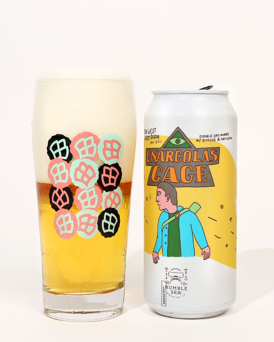
Did you know that Hop Culture Managing Editor John A. Paradiso has a tattoo on his left thigh designed by Frank Scott Krueger? You know what else Frank Scott Krueger draws? The incredible labels on Humble Sea’s cans.
The talented Krueger, Creative Director at branding agency Good Knife, takes inspiration from the beach as much as he does pop culture (Wave Matthews Band IPA, Hilton John IPA, Crash Bandikook West Coast IPA). However, his art style is uniquely his own. Here, we shout out Gnarcholas Cage because it’s a hilarious name. But, it’s also pure Krueger. And delicious.
Lagerish
Flying Machine Brewing Company + Haw River Ales – Wilmington, NC + Saxapahaw, NC
Art by Matt Wiley
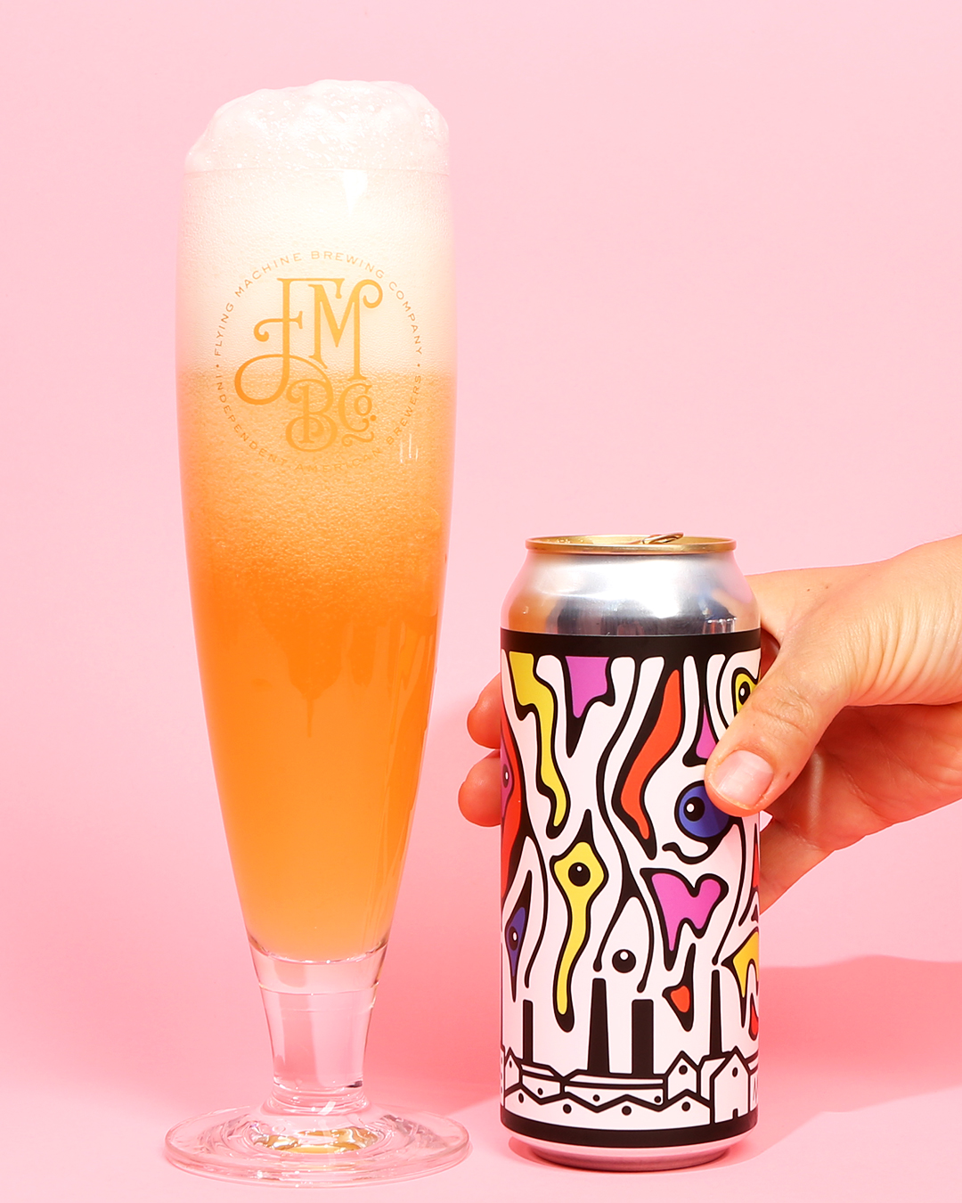
Another tag team creation from two breweries in North Carolina, Lagerish matches form to function by combining a scene from an Old World countryside (the “lager”) with New World designs (the “ish”). Even the palette fits the theme. The countryside is plain black, while the New World designs pop with color.
Another fun fact? Before artist Matt Wiley became Flying Machine’s graphic designer, he served as their R + D brewer.
So you see, kids? Follow your passions and anything is possible.
American Redstart IPA
Red Clover Ale Company – Brandon, VT
Art By Laurie Brooks
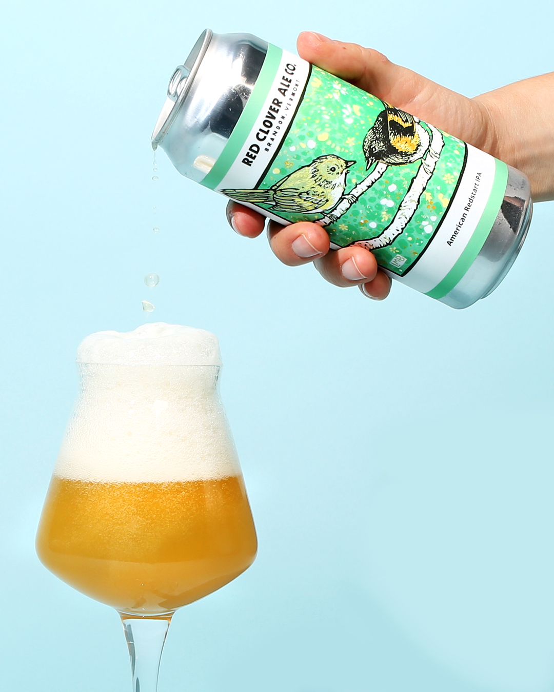
Last year, we named Red Clover Ale Company one of the best new breweries in the country. They continue to impress with their beers but also their rustic art, created by the talented Laurie Brooks (@toadintheholestudio).
We’re firm believers that evocative, emotionally-stimulating art stems from lived experience, and it’s no surprise that Brooks spends her days as a dairy farmer at Wayward Goose Farm in Southwest Vermont.
Snag a beautiful can of Red Clover liquid and take a trip to the country.
Guavango Montoya
Tactical Brewing Company – Orlando, FL
Art By Schiani Ledo
“Hello, my name is Inigo Montoya. You killed my father. Prepare to die.”
With Guavango Montoya, Tactical Brewing Company in Orlando, Florida pays homage to Rob Reiner’s 1987 movie The Princess Bride. Look closely and you’ll see a duo of tropical fruits skewered on the end of Montoya’s sword like the abdomen of Count Rugen.
In reviewing thousands of cans for this piece, we saw so many artists copy pop-culture references, degrading both themselves and the original in the process. But the art of Schiani Ledo and “Florida Weisse” sour with guava, mango, and lactose perfectly capture the playful spirit of actor Mandy Patinkin, whose razor wit and sharp mustache were matched only by the keen edge of his rapier.
CBD Sparkling Water
Untitled Art – Waunakee, WI
Art By Lefan Shi
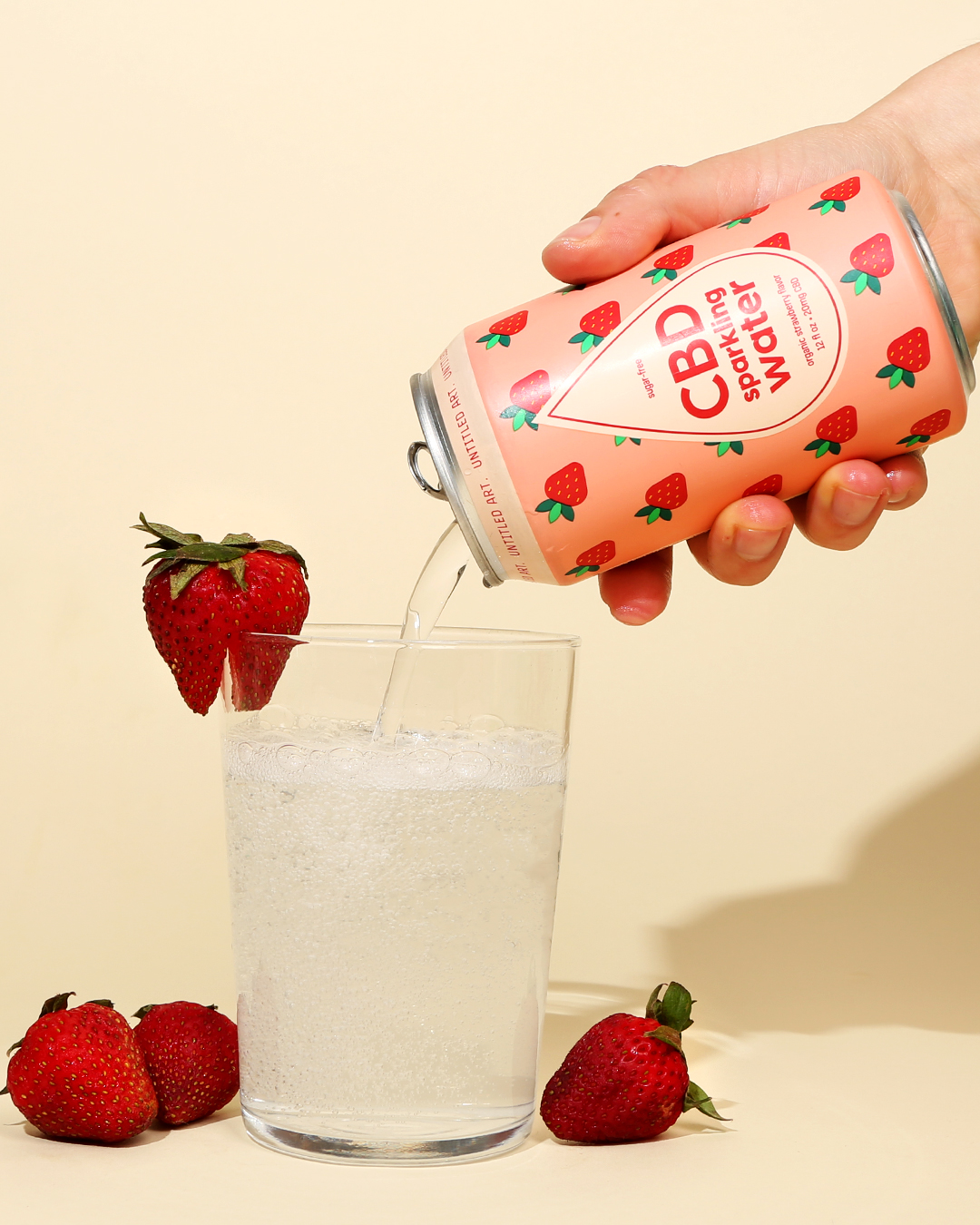
This is the first time a sparkling water has been nominated to one of our “Best Can Designs of the Year” lists. But has any brewery better captured the contents of a can through design than Untitled Art? With their line of CBD-infused sparkling waters, the joint project between Levi Funk of Funk Factory and Isaac Showaki of Octopi Brewing eschewed their usual design for something equally minimal but with a touch more color. The result is something akin to the magic potion that turned Alice’s world upside down.
With each product, Untitled Art promises a clean, flavorful, and lighthearted experience. And every element of the can reinforces this idea. Notice the border around “CBD Sparkling Water” — the frame takes a teardrop shape, suggesting a juicy, thirst-quenching liquid even before the product touches your lips. We love this can not only because it’s bright and fun, but because it packs each essential detail with layers of meaning.
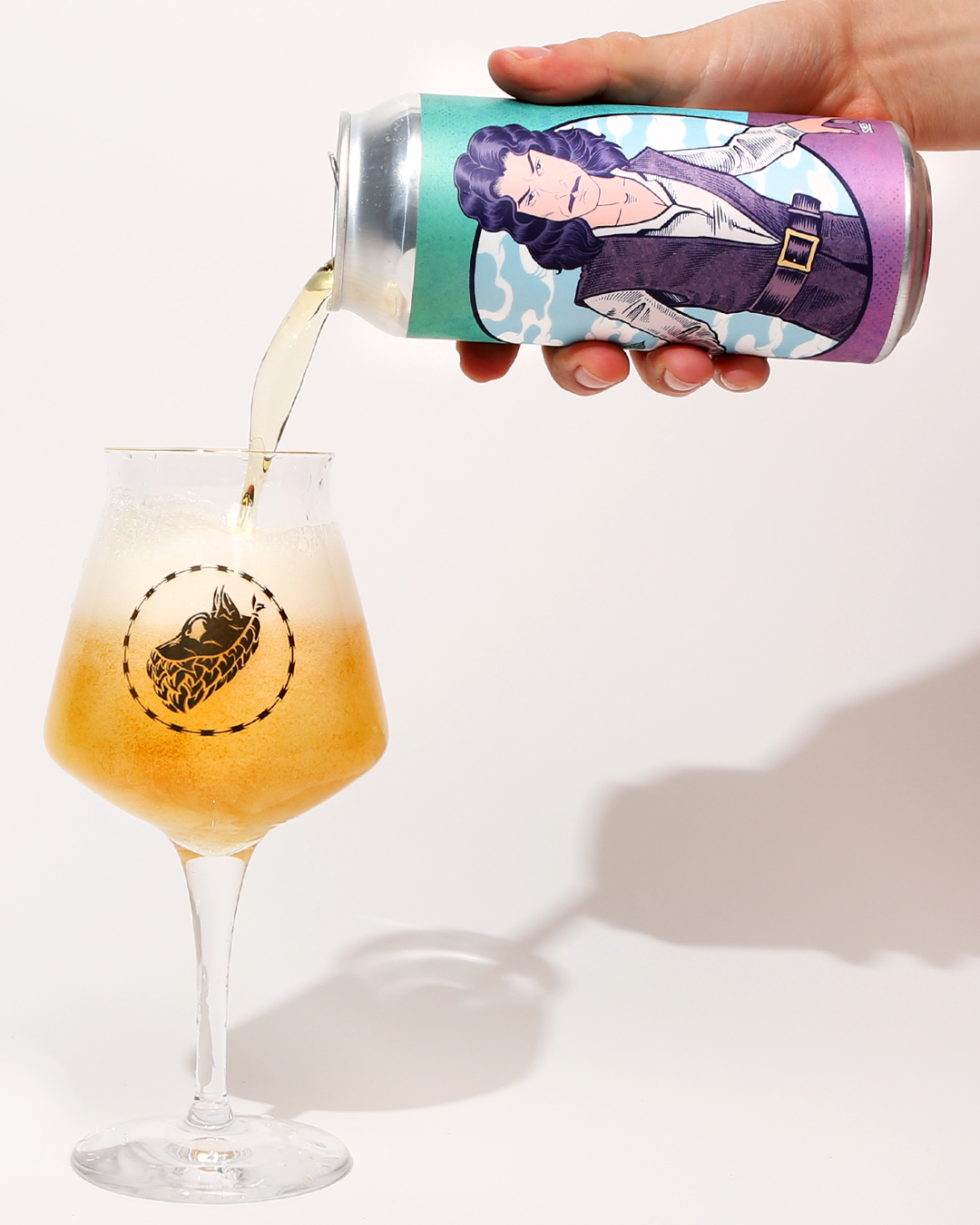
Turn of the Tides
Channel Marker Brewing – Beverly, MA
Art By Andrew Houle
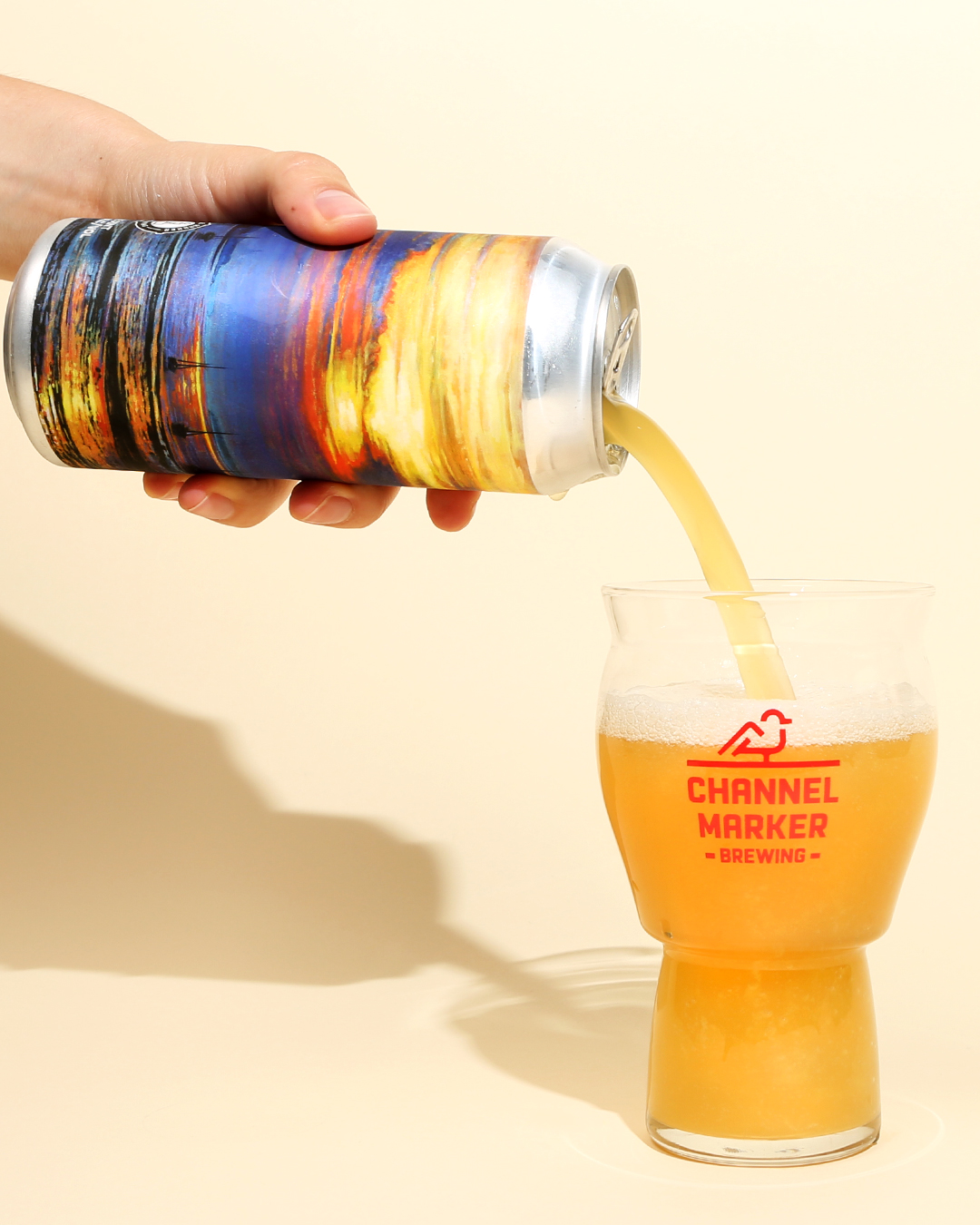
We love a brewery that riffs on a theme. And from their brewery name to the names of their beers (Navigate the Channel, Propeller, Flagship…), Channel Marker Brewing plays with nautical tropes to reinforce a sense of place: smack dab on the coast of Massachusetts, just outside of Salem.
With Turn of the Tides, that theme gets a boost from the art of Andrew Houle. Looking almost out of place on a beer can, Houle’s gallery-worthy art works wonders with light and clouds to place the scene firmly off Massachusetts’ coast. Look at the can and you can almost feel the salt in your hair.
Super Mega Dank 420 Kush Grand Daddy Supreme
Double Nickel Brewing Company – Pennsauken Township, NJ
Art By John Dalsey
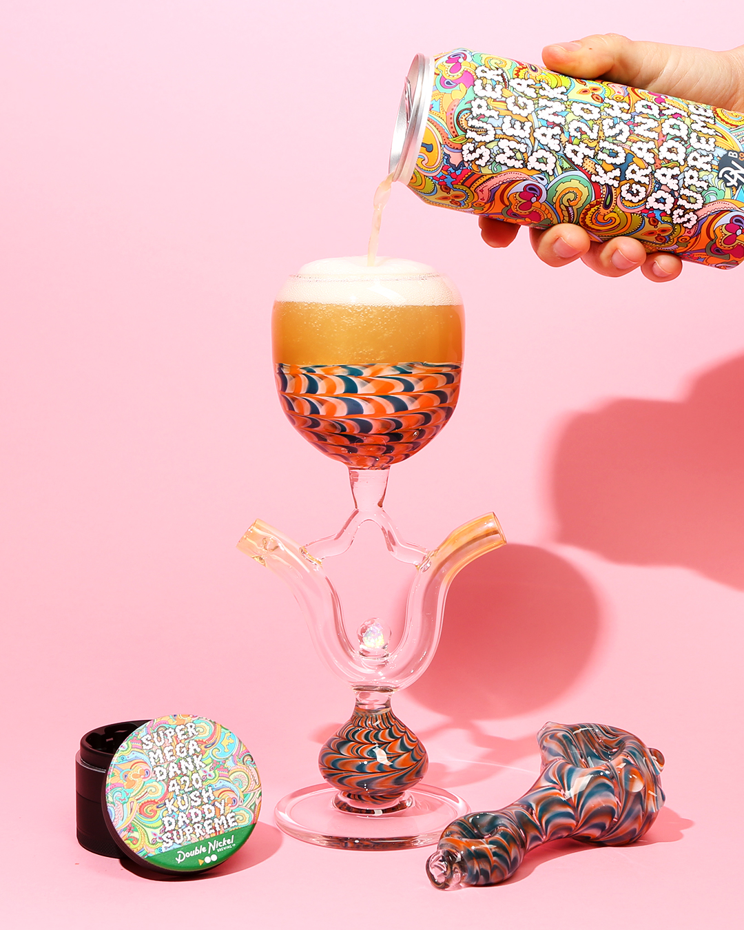
A special release for the annual 4/20 holiday, Super Mega Dank 420 Kush Grand Daddy Supreme (SMD420KGDS from here on, though that’s not much easier…) portended New Jersey’s historic Cannabis Regulatory, Enforcement Assistance and Marketplace Modernization Act (another mouthful). The takeaways: pot is now legal in New Jersey. And this label rocks.
Rare is the product that pokes fun at its audience but manages to laugh with them at the same time. But SMD420KGDS does exactly that. While the colors, name, and cartoon letters reek of a bad stoner joke, the execution elevates the can to high art. It’s a masterful stroke by a young artist who also happens to co-own the brewery.
#ISO
Pure Project Brewing – San Diego, CA
Art By Dustin Ortiz
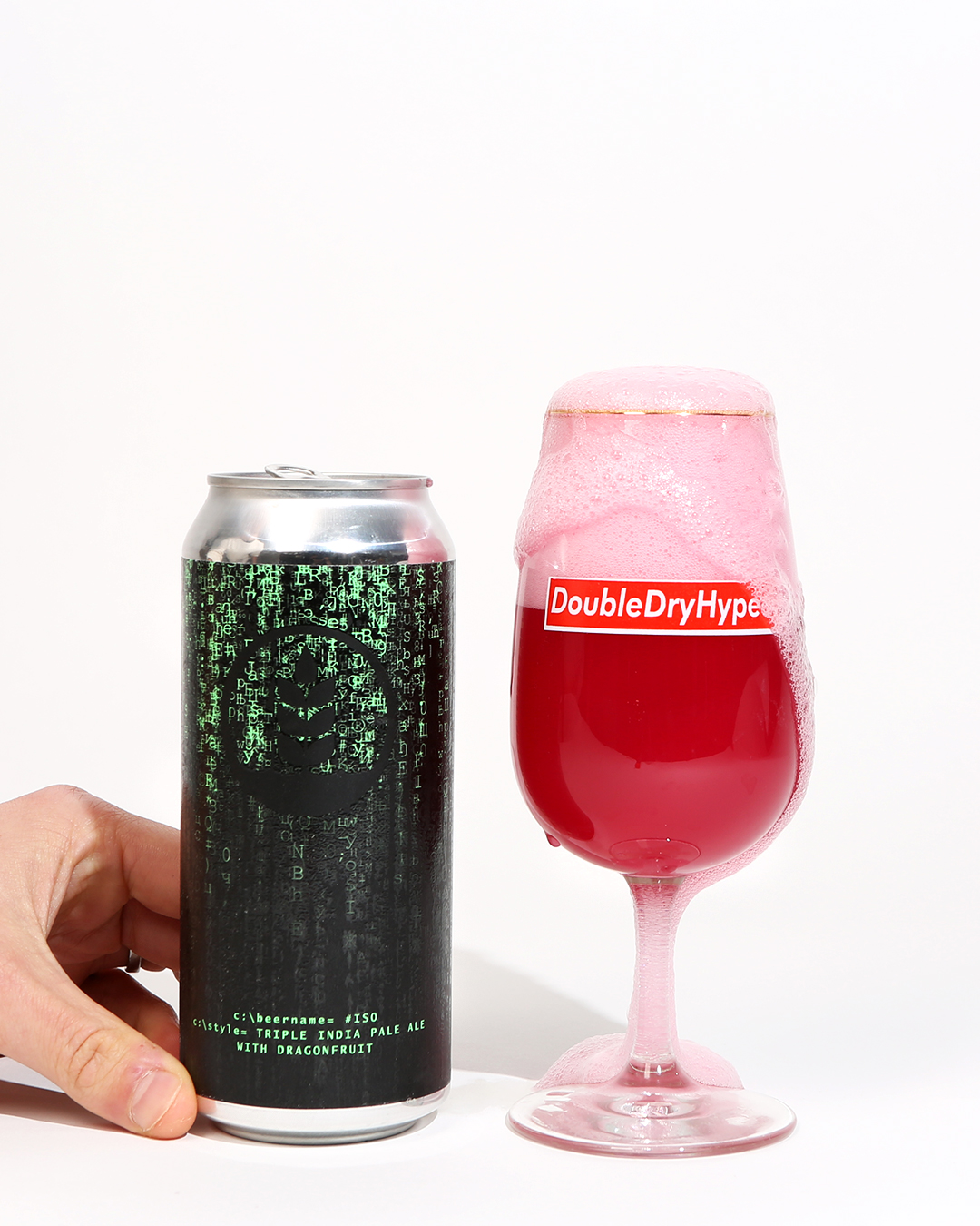
Sometimes, the beer industry makes me feel like I’m living in the Matrix. There’s a lot of weird stuff out there, you know? But pop the red pill and travel back to 1999 with this can from Pure Project Brewing in San Diego.
Just as Keanu Reeves fought the machines in a battle for reality, the “pure” in Pure Project speaks to a pursuit of something real. In this case, high-quality, sustainably produced beer inspired by the indigenous ingredients of Costa Rica. A member of 1% For The Planet, the brewery has donated over $100,000 to non-profit organizations. The brewery’s mission, beer, and art align perfectly on this cleverly designed can, featuring the green rain that represents activity in the Wachowski Sisters classic.
Haze Charmer
Tröegs Independent Brewing – Hershey, PA
Art By Lindsey Tweed
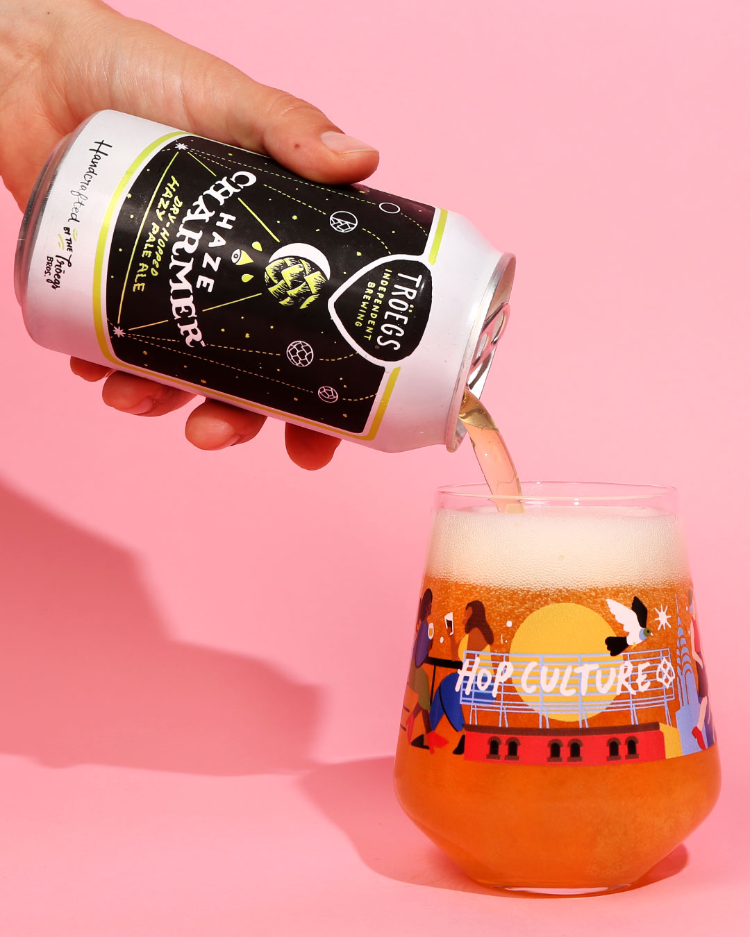
It’s not easy to rebrand a legacy organization with design assets that pay homage to the past while also looking to the future, and to do it in a way that makes the brand more powerful than ever. Such was the challenge that Lindsey Tweed faced, and we think she did a bang-up job.
The leadership at Troegs also deserves credit for letting go of a design style that must hold a tremendous amount of sentimental value. But we think they made the right choice.
The old Troegs labels, while incredible in the same vintage sort of way as your dad’s party sweater from college, is good as a novelty. But it doesn’t make sense in 2020. The new labels not only give the brand new life, but also rank right up there as some of the coolest in the industry.
Thank You For Existing
DSSOLVR – Asheville, NC
Art by Mike Semenec
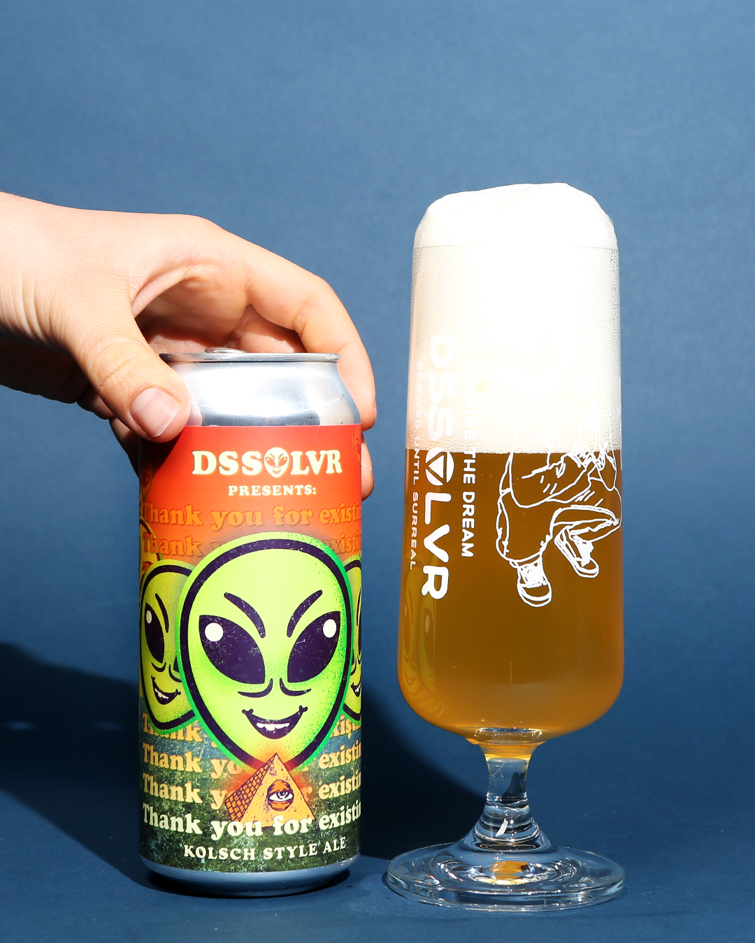
DSSOLVR celebrates the surreal, a cultural movement perfectly embodied in the strange art of co-founder Mike Semenec. Like René Magritte, Salvador Dalí, and Max Ernst, and the other Surrealist artists, Semenec juxtaposes color (who would’ve expected orange and green to go together so well?) as well as art elements.
On this can, the classic figure of the dangerous, invading alien looks almost friendly. With the name of the beer under the figure, it almost seems as if the alien itself is thanking the drinker for existing. And what’s kinder than that?
Additionally, DSSOLVR mixes things up by placing Kolsch — a traditional German-style — on a menu with New School styles like their terrific hazy IPAs and sours.
The results? A beer and can that nail the surreal aesthetic.
Hollywood Acid
Brouwerij West – San Pedro, CA
Art By Killer Acid
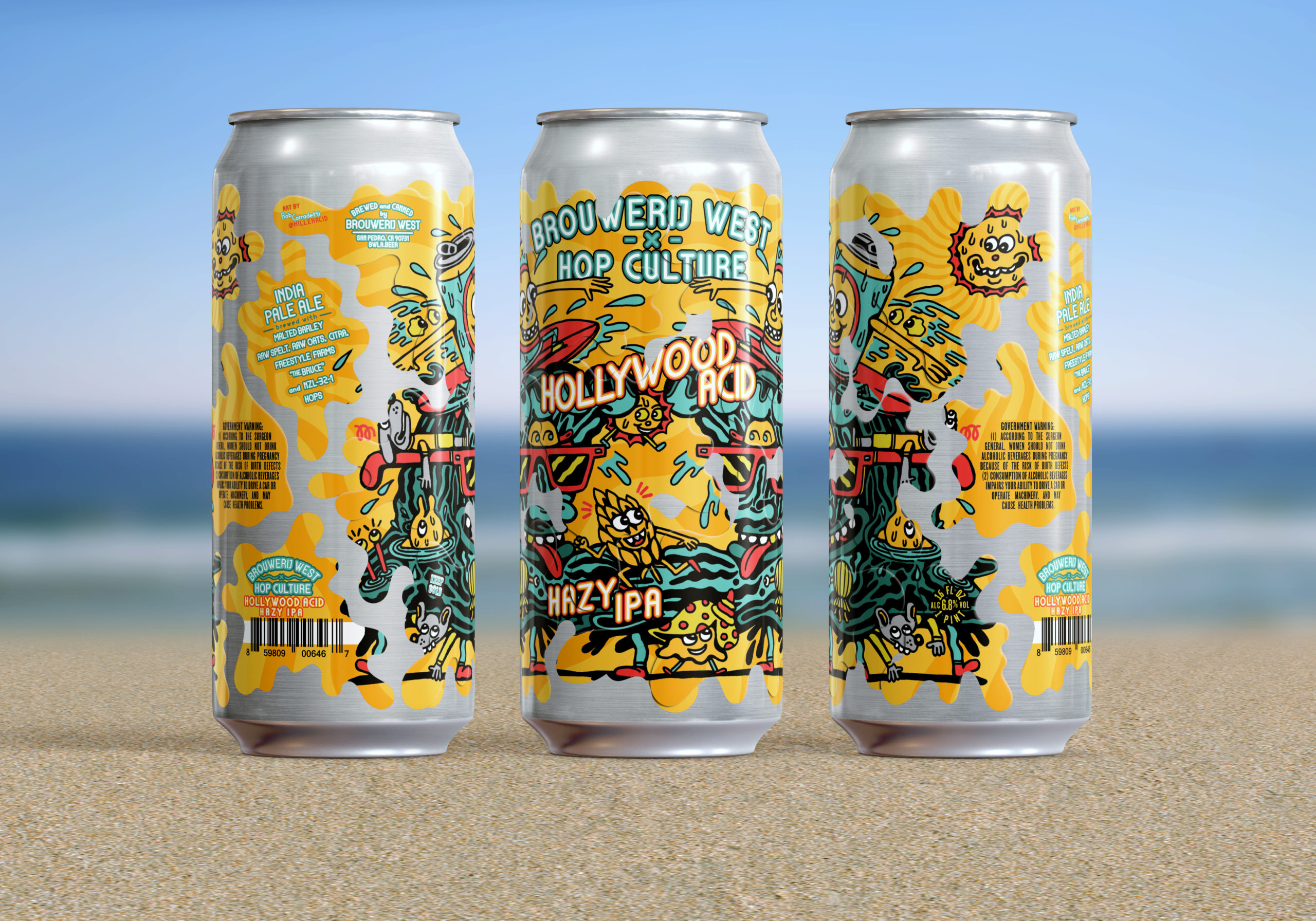
Editor’s Note: Hollywood Acid is a collaboration between Brouwerij West and Hop Culture.
If you’ve ever seen a Brouwerij West label, you know any of their products would’ve made a worthy inclusion to this list. The brewery uses a special application process to turn their cans into works of art. We’re huge fans of the Popfuji and Bounce cans, but Hollywood Acid — with art drawn by our Northern Californian friend Killer Acid — holds a special place in our hearts.
By day, Killer Acid creates art for his own online store as well as several major brands: Zumiez, Urban Outfitters, and Pittsburgh’s own Vinyl Remains, to name a few. But he occasionally works with us for fun beer projects. And that includes this label for Brouwerij West’s Hollywood Acid.
The talented team at Brouwerij West then took Killer Acid’s art and made it even more special with the aforementioned label application process, which saw the design chopped, screwed, and applied as several individual stickers. The result was one of the most interesting cans we’ve seen this year, not to mention one of the best Double IPAs.
Imperial Somethin’ Got Played In The Mail
Wiley Roots Brewing Company – Greeley, CO
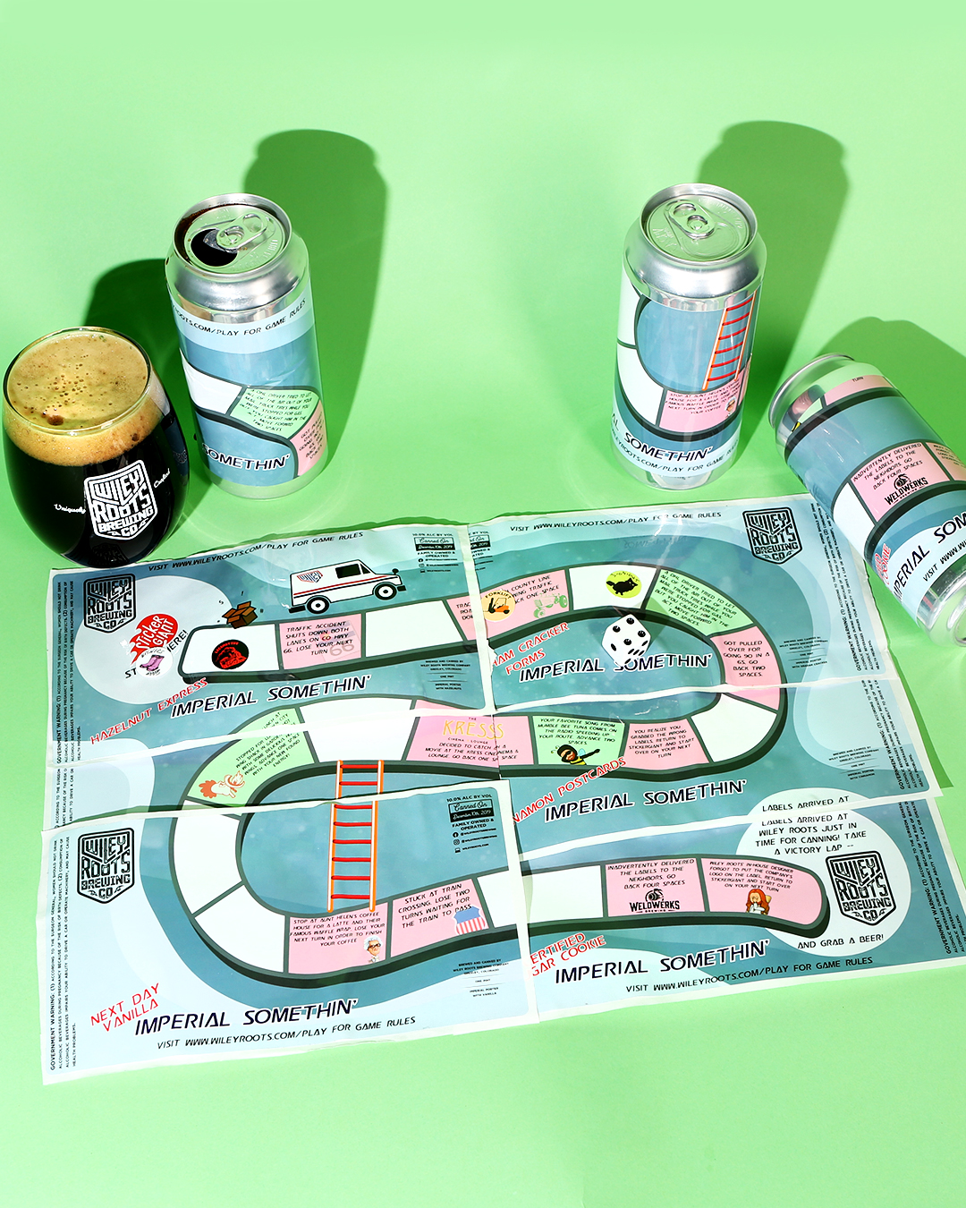
While everyone else is out there playing checkers, Wiley Roots is mastering 3D chess. Their Imperial Somethin’ Got Played In The Mail is actually a series of six beers. Each is a riff on the same base beer. It includes Hazelnut Express, Graham Cracker Forms, Cinnamon Postcards, Chai Stamps, Next DayVanilla and Certified Sugar Cookie.
But the real joy of the Imperial Somethin’ Got Played In The Mail series is the labels. When peeled off and put together on a table or inside a case tray, the six labels form a Chutes and Ladders-style board game in which players race to deliver Wiley Roots their can labels before the next release.
Even if you enjoy the beer and not the game, it’s easy to appreciate the ingenuity that Wiley Roots brings to the table. Shoutout to ingenuity and this incredible series!
Out to Pasture
Resident Culture Brewing Co. + Outer Range Brewing Co. – Charlotte, NC + Frisco, CO
Art By Maryssa Pickett
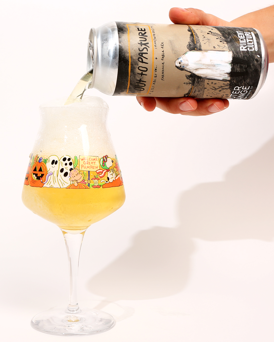
In case you couldn’t tell from our series of Spooky Brews Halloween festivals, we’re big fans of the spookiest time of year. So this collaboration from Resident Culture and Outer Range was right up our alley.
Featuring the unmistakable style of artist Maryssa Pickett, the Out to Pasture design was both charming and haunting. Like it could have been in a vintage folk storybook. Resident Culture has some of the best can designs in the industry and this was up there as one of our favorites.
The Very Thirsty Caterpillar
Oozlefinch Beers & Blending – For Monroe, VA
Art By Vaiva Rimeika
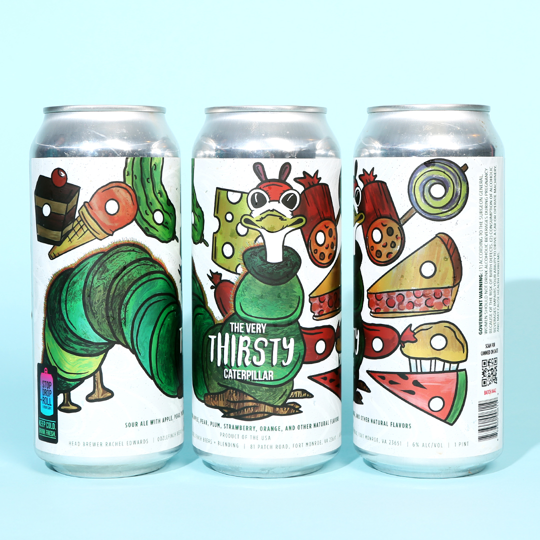
Speaking of storybooks, this riff on the children’s book classic The Very Hungry Caterpillar was serious nostalgia-fuel. Oozlefinch’s artist Vaiva Rimeika perfectly captured the whimsy and charm of Eric Carle’s character. And the accompanying glass that Oozlefinch produced tied the release together wonderfully.
In an era where many breweries just copy and paste cartoon characters on their can designs, it was fun to find an artist play with an established character and make something unique with it.
Upcountry
Outer Range Brewing Co. – Frisco, CO
Art By Dianna Riggs
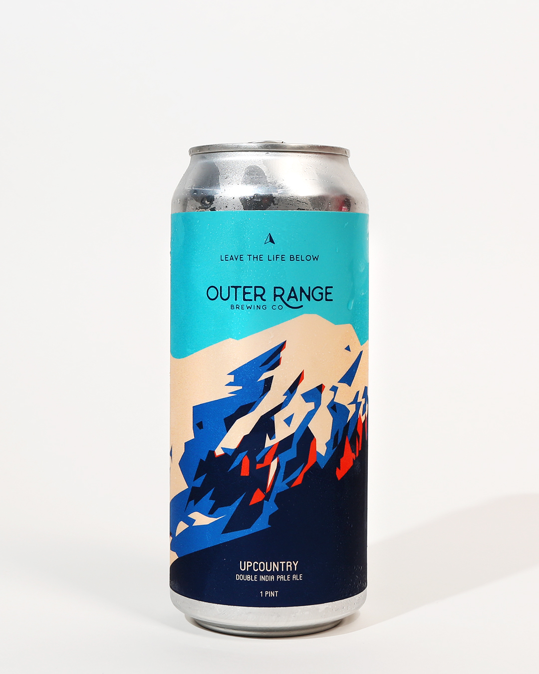
In most of their designs, Outer Range Brewing Co. tells a story of place. Nestled high in the mountains outside of Denver, the brewery draws inspiration from its surroundings, turning the rugged landscape into compelling beer names and labels. Nowhere is this more apparent than in Upcountry, a Double IPA that adds a splash of color to a snowy peak.
Dianna Riggs did a terrific job reinterpreting the mountains into a colorful, geometric scene that evokes a strong sense of place. One look at the can and you feel like you’re getting ready for a ski trip. The sky is blue, the mountains are cobalt, and the peaks are tipped with pristine snow. A glance and you can practically smell the pine.
Leave the life below and take a trip to Frisco without even leaving your couch.
We Are America
Good Word Brewing – Duluth, GA
Art by Rachel Eleanor
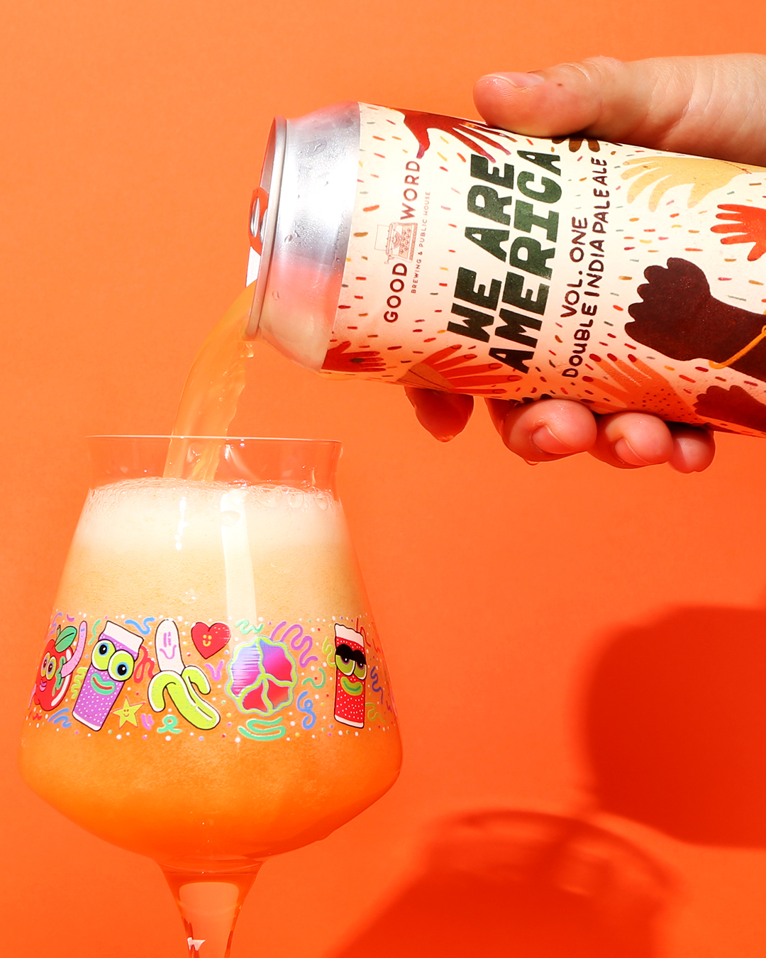
In a contentious election year, Rachel Eleanor and Good Word Brewing in Duluth, Georgia, deserve kudos for We Are America, a beer brewed to benefit the Equal Justice Initiative. For those keeping track, Good Word is the same brewery that turned their restaurant into a soup kitchen when COVID first hit.
When looking at We Are America, it’s easy to feel hopeful as hands of all shapes, sizes, and colors reach toward the hand-lettered typography. However, it’s clear the hands aren’t reaching toward anything in particular. Rather, the hands are lifting in triumph and celebration of a shared humanity.
We’re suckers for positivity and those who use their platforms as a force for good. Eleanor and Good Word easily won us over with their celebration of peace.
Steamin’ Key Lime
Tripping Animals Brewing Co. – Doral, FL
Art By Ignacio Montenegro and David León
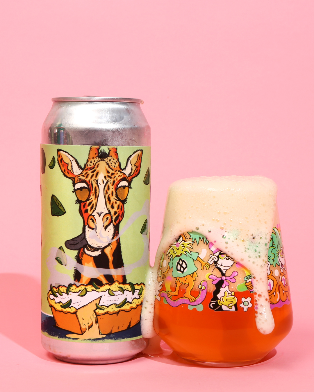
Tripping Animals in Doral, Florida, has been one of our breakout breweries of the year, as clearly evidenced by Hop Culture Managing Editor John A. Paradiso’s glowing review. We love their team, their beer, and their brilliant art, which features a variety of very stoned animals.
Does it make sense? Not really. But it’s extremely well-done and consistent. Plus, fits the “tripping” theme. (Most Americans use the word when referring to a psychedelic experience, but in Venezuela, where the Tripping Animals founders are from, “tripping” means having a good time.)
And wouldn’t you know it, one of the co-founders himself is an artist. The next time you’re in Miami’s “Little Venezuela,” aka Doral, visit the talented team at Tripping Animals and chat about art (or beer) with Ignacio Montenegro.
Liked this article? Sign up for our newsletter to get the best craft beer writing on the web delivered straight to your inbox.